← Back

Case 1 · ueno bank

It all started with “we just need a little message.”

Spoiler: a little message wasn’t all we needed.

Responsibilities
Content strategy, use cases, flows and interaction decisions.
AI
Figma Agent, Gemini and Claude
Results
Solution shipped and an observed drop in support queries

Project summary

What started as a request to communicate a restriction ended up as a redesign of several flows in the Cobros app.

I worked with Product Design, Product and Engineering to identify scenarios nobody had accounted for, define how the interface should respond and help people understand what they could do to keep getting paid.
The challenge

Product needed to tell people without a RUC (Paraguay’s taxpayer ID) that they could no longer get paid with QR Pix or with QR codes from other banks.

The catch was that they used to be able to.

Before

  • ueno QR
  • Argentina QR
  • QR Pix
  • Other banks’ QR

After the change, without a RUC

  • ueno QR
  • Argentina QR
  • QR Pix
  • Other banks’ QR
Same people, fewer ways to get paid.

Product asked for a message that said “You don’t have a RUC. Sort out your situation.”

But was it enough to tell them what they could no longer do?

The message they asked for

“You don’t have a RUC. Sort out your situation.”

  • What’s a RUC?
  • How do I get one?
  • What do I need to use those methods again?
One message, several unanswered questions.

The challenge was to explain the restriction without leaving people without answers.

My role on the team

I worked as a UX Content Designer, paired with a Product Designer. Although my focus was content, I was involved in experience design decisions from the earliest stages.

My work included:

  • 01

    Defining use cases and flows, together with Product Design.

  • 02

    Exploring content and interaction alternatives, with AI as a thinking partner.

  • 03

    Working with Product and Engineering to understand business rules and technical constraints.

  • 04

    Designing messages and documentation for the app and the help channels.

  • 05

    QA reviews to support the implementation.

The context

When we reviewed the request, we found that not having a RUC wasn’t the only scenario we needed to solve.

There were also operational and transactional limits that affected payment links and were shared with Transfers.

A person could hit a partial limit, reach the total amount allowed or run into different restrictions depending on their tax status.

My design partner and I built a flow map and a case matrix to make sense of those combinations.

The case matrix, in short

SituationWhat’s affectedWhat the person finds
No RUCQR Pix and other banks’ QRDisabled options and a callout with “Learn more”
Partial limitPayment linkThe calculator shows how much they can collect
Total limitPayment linkA warning with the next steps
Someone else’s RUCRUC validationAn error that says which detail to check
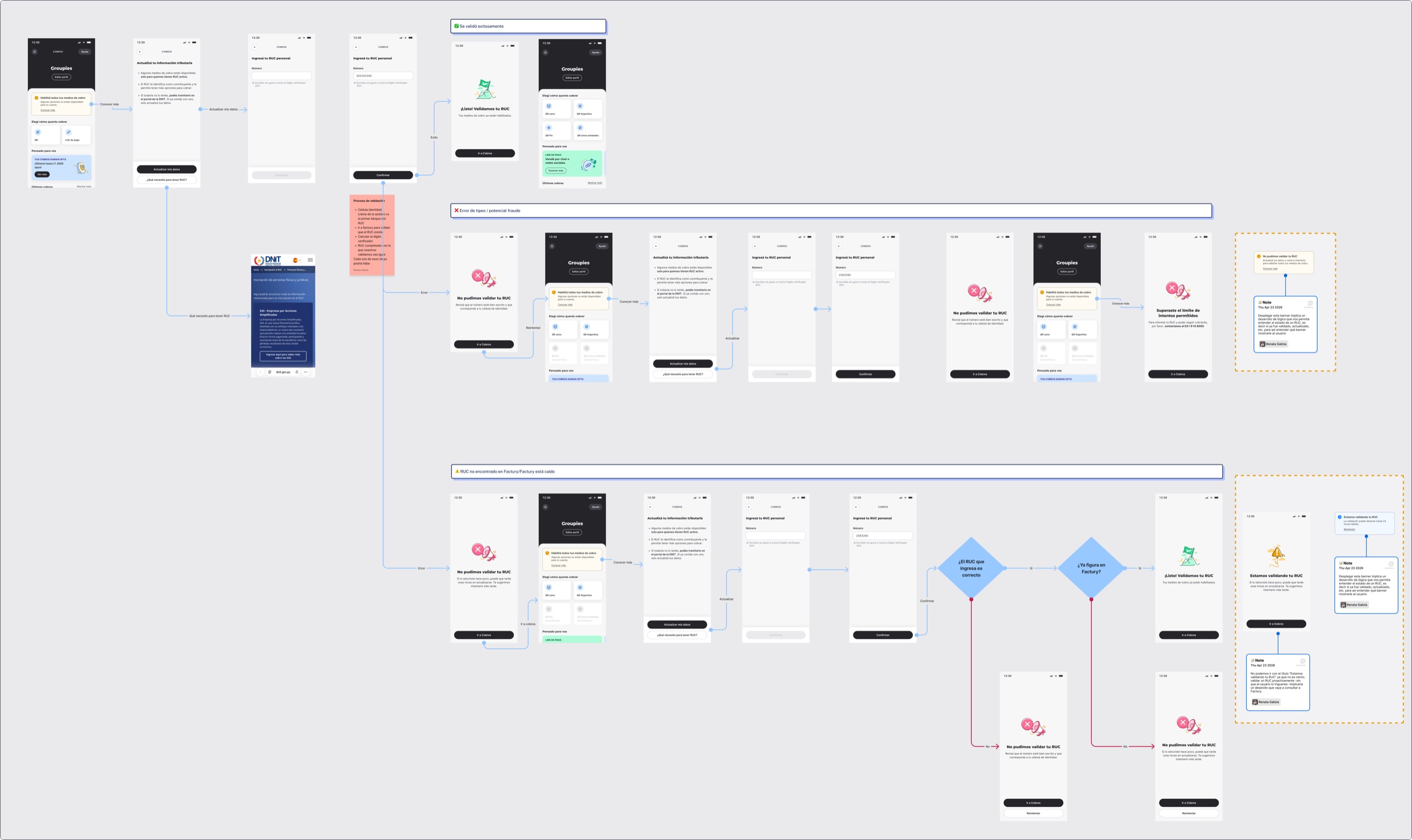
Full flow in Figma: the happy path, the error for a RUC that doesn’t match and the case where the RUC isn’t in the system yetView larger ↗
The flow map. Part of the Figma deliverable.

I also created a Gem in Gemini with product documentation, research and content guidelines to explore alternatives.

What I fed it

  • Product documentation
  • Research
  • Content guidelines
Gem in GeminiCobros

What I used it for

  • Explore content alternatives
  • Explore interaction alternatives

The decisions

01Anticipate the restriction instead of waiting for the error

If we already knew someone couldn’t use certain QR codes, why wait for them to try?

We proposed disabling those methods right on the main screen and adding a callout that explained the situation.

Wait for the error

Taps QR PixError

Anticipate the restriction

Sees the disabled QR codes and a callout“Learn more”

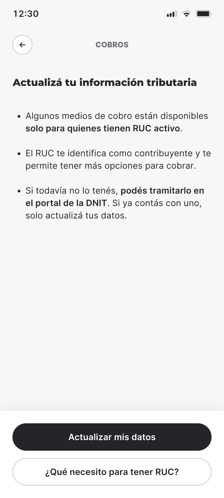
From “Learn more”, the person could find out what the RUC was for and choose between updating their details or learning how to get one.

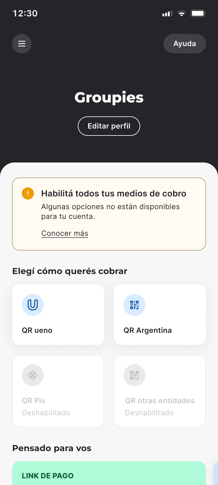
Cobros main screen (in Spanish): QR Pix and other banks’ QR appear disabled, with a callout that says “Enable all your payment methods” and the action “Learn more”
1. Disabled methods and a callout
Learn more
Screen “Update your tax information” (in Spanish) with three points and two buttons: “Update my details” and “What do I need to get a RUC?”
2. What the RUC is for, and two paths
Update my details
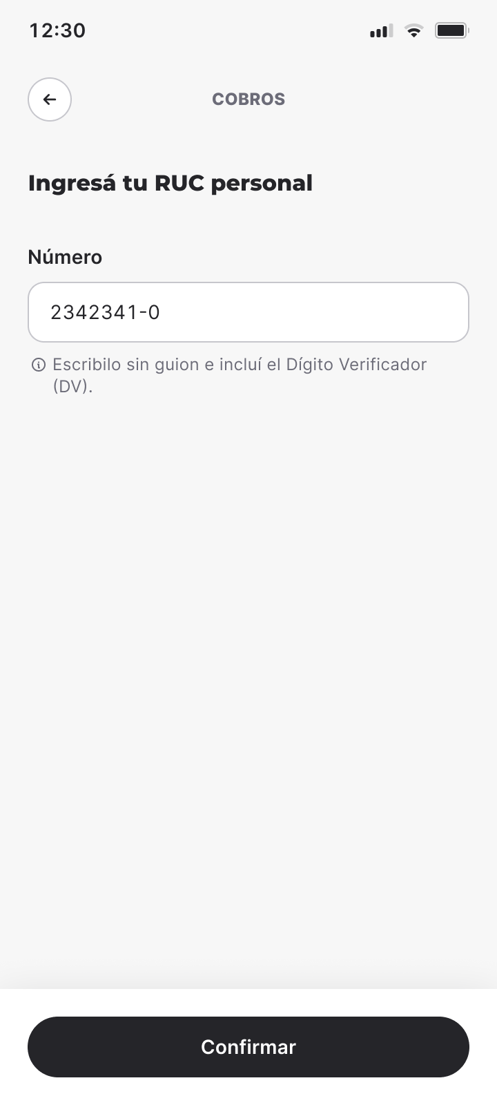
Screen “Enter your personal RUC” (in Spanish) with the field to type the number
3. If they already have a RUC, they enter it

The shift was going from “sort out your situation” to explaining what was happening and how to move forward.

02Don’t show the same error for everything

The payment link limits needed different answers.

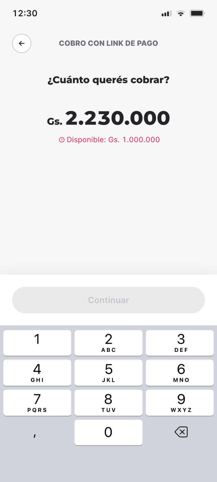
If the person could still collect part of the amount, the calculator showed how much they had available.

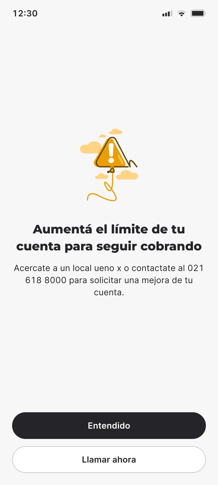
If they had reached the total limit, they got a warning with the next steps.

Partial limit

Payment link calculator (in Spanish) with the notice “Available: Gs. 1,000,000”
The calculator shows how much they have available

Total limit

Warning (in Spanish) “Raise your account limit to keep getting paid” with the actions “Got it” and “Call now”
A warning with the next steps

We also aligned the messages with Transfers, because both features shared limits.

The interface’s response had to depend on what each person could actually do.

03Consider what happened outside the flow

While designing, we realized we needed to check that the RUC matched the person’s national ID, so no one could register someone else’s.

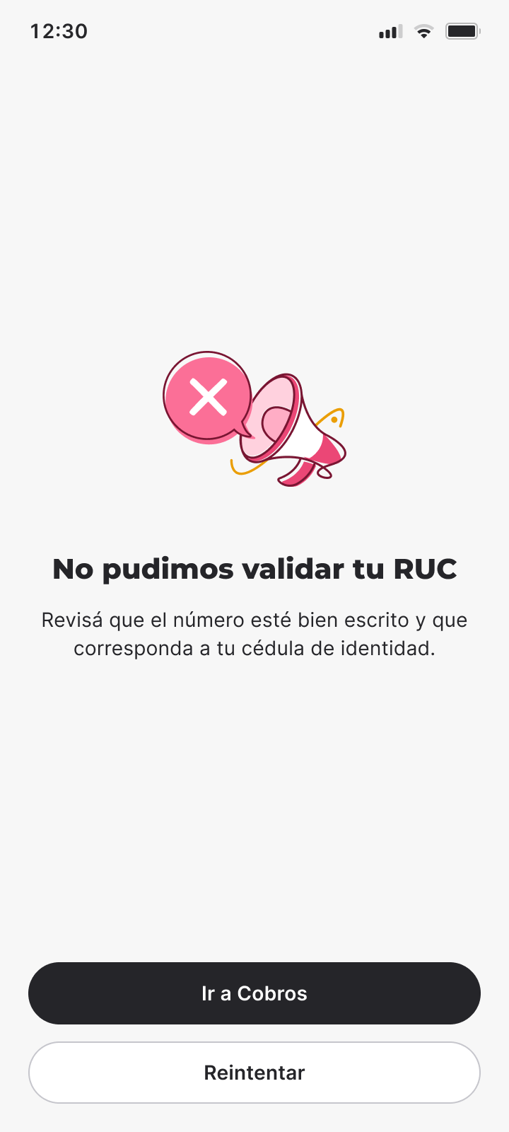
Error (in Spanish) “We couldn’t validate your RUC. Check that the number is typed correctly and that it matches your national ID”

The message says what to check

It points to the two details to look at: that the number is typed correctly and that it matches their national ID.

I also wrote FAQs for the Help Center and for uendi, the bank’s chatbot.

The idea was for people to find answers even if they needed help outside Cobros.

Results and impact

The solution went live and made it possible to communicate restrictions ahead of time, with different answers for each situation.

After shipping it, we saw a drop in the queries about QR Pix and other banks’ QR restrictions that reached the Experience team and uendi.

I don’t have an exact percentage for that drop, so I’d rather not make one up.

One improvement was left pending, too.

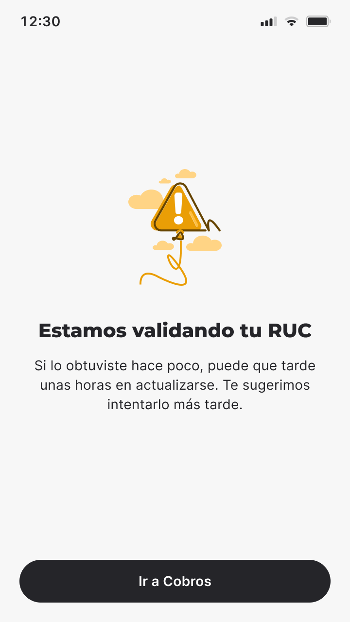
We discovered that RUC data could take a while to update, even when a person had already completed the paperwork.

We proposed adding a “We’re validating your RUC” state to avoid showing an error when it might just be a delay in updating the data.

The person enters their RUC

ValidatedTheir payment methods are enabled
We couldn’t validate itThey need to check the number and their ID
We’re validating itThe data hasn’t been updated yetProposal
Proposal (in Spanish) “We’re validating your RUC”: if you got it recently, it can take a few hours to update
Not implemented
A delay isn’t an error

It required technical logic that wasn’t available yet, so we documented it for a future iteration.

What I take away

Projects like this always remind me that you don’t always have to take a request literally.

If we had stuck with the initial request, we would have delivered an error message.

But by working closely with Product and Engineering we found other scenarios and designed a more complete experience.

The request

An error message

What it became

  • Methods disabled before the error
  • An explanation and two paths forward
  • Answers based on the limit reached
  • RUC validated against the national ID
  • FAQs in the Help Center and in uendi
  • An improvement documented for later

It was also an opportunity to take part in decisions that went beyond content, from defining flows to how the interface behaved.

Work often starts with a sentence someone needs to show on a screen and ends up being a conversation about how the product should work.