← Back

Case 2 · upay, by ueno bank

We were going to add a few plans. We ended up redesigning the whole onboarding.

A case about a business that changed its model, a form with odd questions and a sign-up that ended up living in three different places.

Responsibilities
Content strategy, information architecture, flow definition and interaction decisions.
Tools
Figma, user research, benchmarking and product documentation.
Results
Onboarding shipped across three channels and more than 1,700 sign-ups in two months.

Project summary

upay was changing its business model and needed to add subscription plans to its onboarding.

What looked like a small adjustment turned into a complete redesign of the sign-up, from plan selection to the communications sent after signing up.

I worked with Product Design, Product and Engineering to simplify the flow and adapt it to different types of merchants, products and channels.
The challenge

For a long time, upay had run on a model based on POS terminals and per-transaction fees.

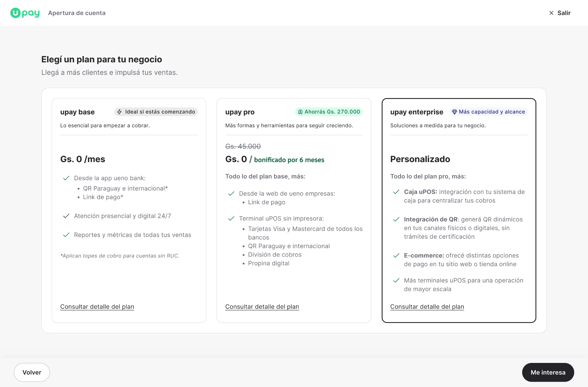
But the business was changing: we would now offer three plans.

Before

POS terminals

And per-transaction fees.

Now: three plans

  • BaseFree
  • ProPaid, with one terminal included
  • EnterpriseFor merchants with bigger needs
If the way of selling changed, the way of signing up had to change too.

The initial request was to add these plans to the existing onboarding.

The problem was that the flow had been designed for a different business model and had plenty of room for improvement.

Adding a screen to pick a plan wasn’t enough. We had to rethink the whole sign-up experience.

My role on the team

I worked as a UX Content Designer, paired with a Product Designer. Although my focus was content, I was involved from the start in decisions about the structure and behavior of the onboarding.

My work included:

  • 01

    Auditing the previous flow, identifying content and usability problems.

  • 02

    Defining flows and use cases, together with Product Design.

  • 03

    Designing content and interactions for the different plans and account types.

  • 04

    Transactional communications strategy, based on the outcome of each sign-up.

  • 05

    Working with Product and Engineering, from exploration to implementation reviews.

The context

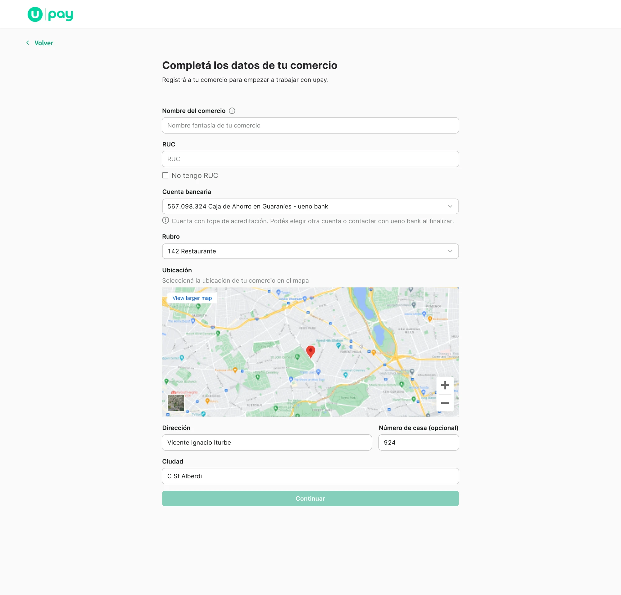
The previous onboarding packed too much data into a single screen and asked questions that didn’t always reflect what merchants needed.

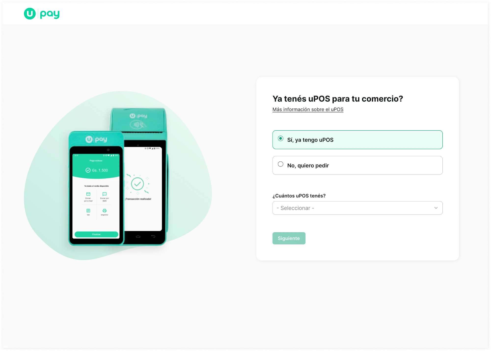
For example, it asked “Do you already have a POS?”, but didn’t clearly account for people who already had one and wanted another.

The previous onboarding.

We also found something interesting: roughly 90% of sign-ups came through sales representatives, who usually walked merchants through sign-up.

9/10

sign-ups came through sales representatives (approx.)

That led us to ask whether the experience could also work for people who preferred to sign up on their own.

To understand the problem, we audited the flow, reviewed existing research and analyzed references from other products.

We didn’t have drop-off metrics for the previous onboarding, so we avoided drawing conclusions the data didn’t support.

The decisions

01Help people choose a plan without showing everything at once

Each plan had its own benefits, conditions and fees. Showing it all on one screen would have made them harder to compare.

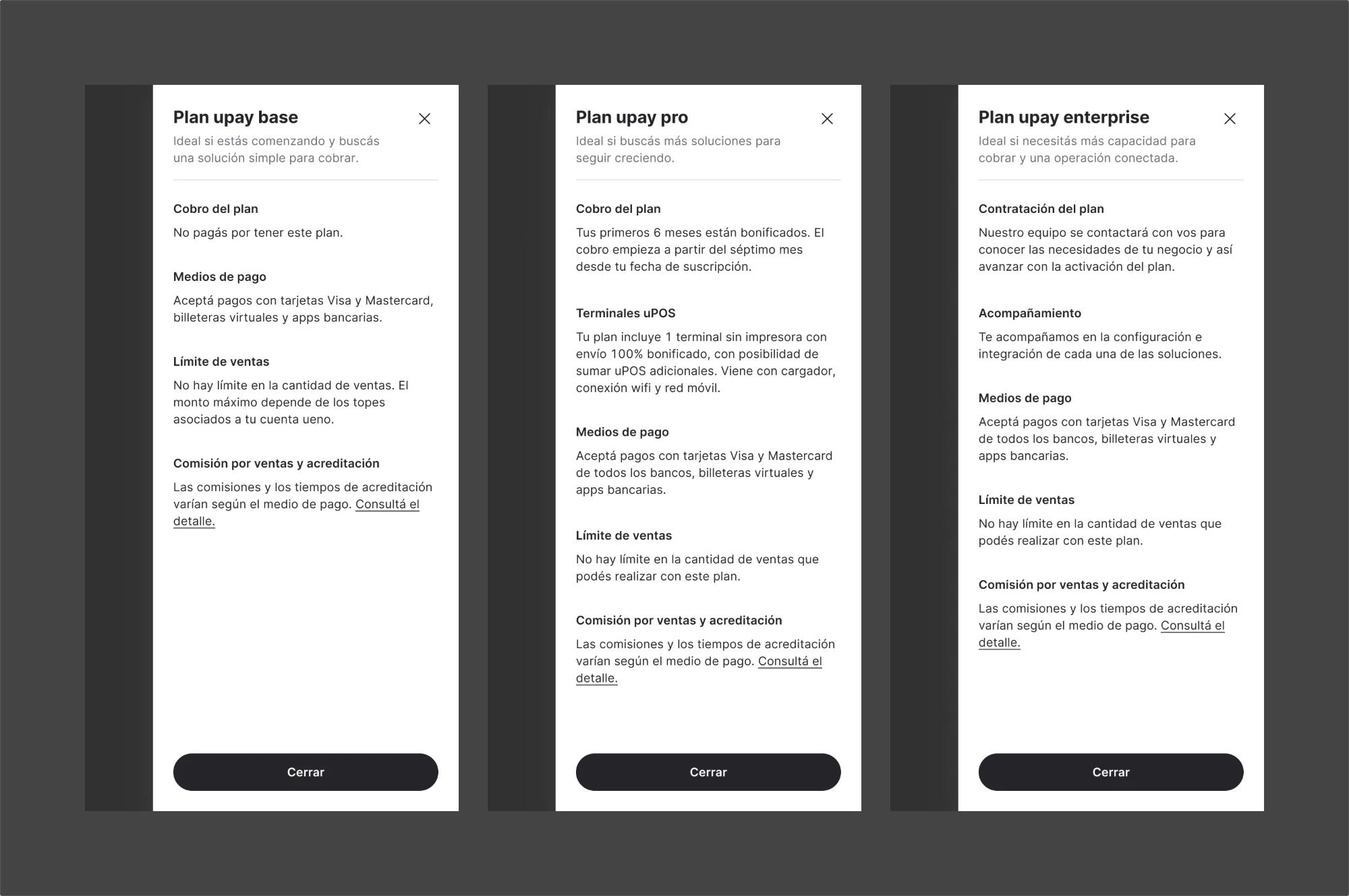
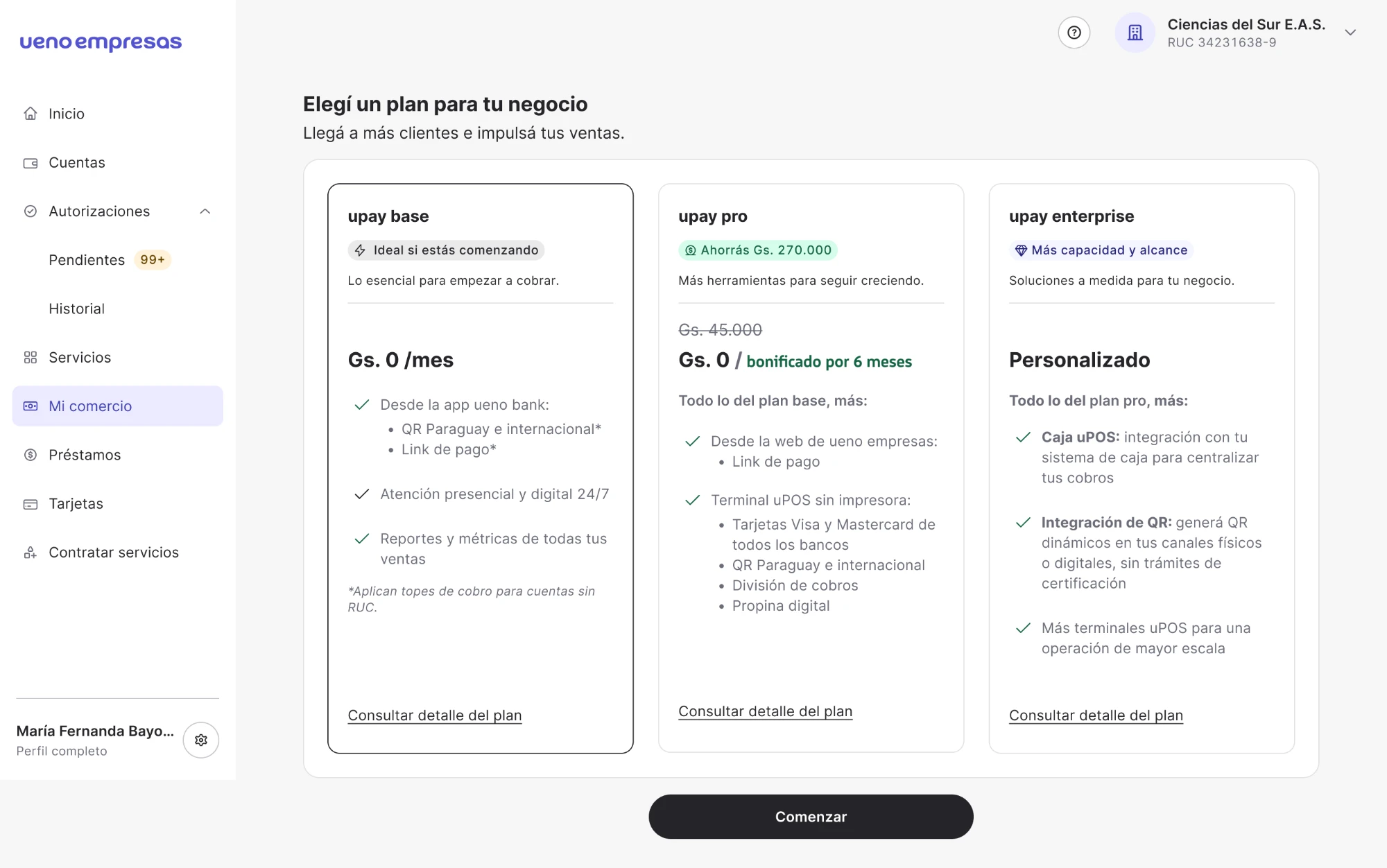
We designed cards that prioritized the value proposition, the price and the main benefits. For more details, we added a side panel.

Side panels (in Spanish) with the details of each plan: payouts, payment methods, limits and fees
For more details: a side panel.

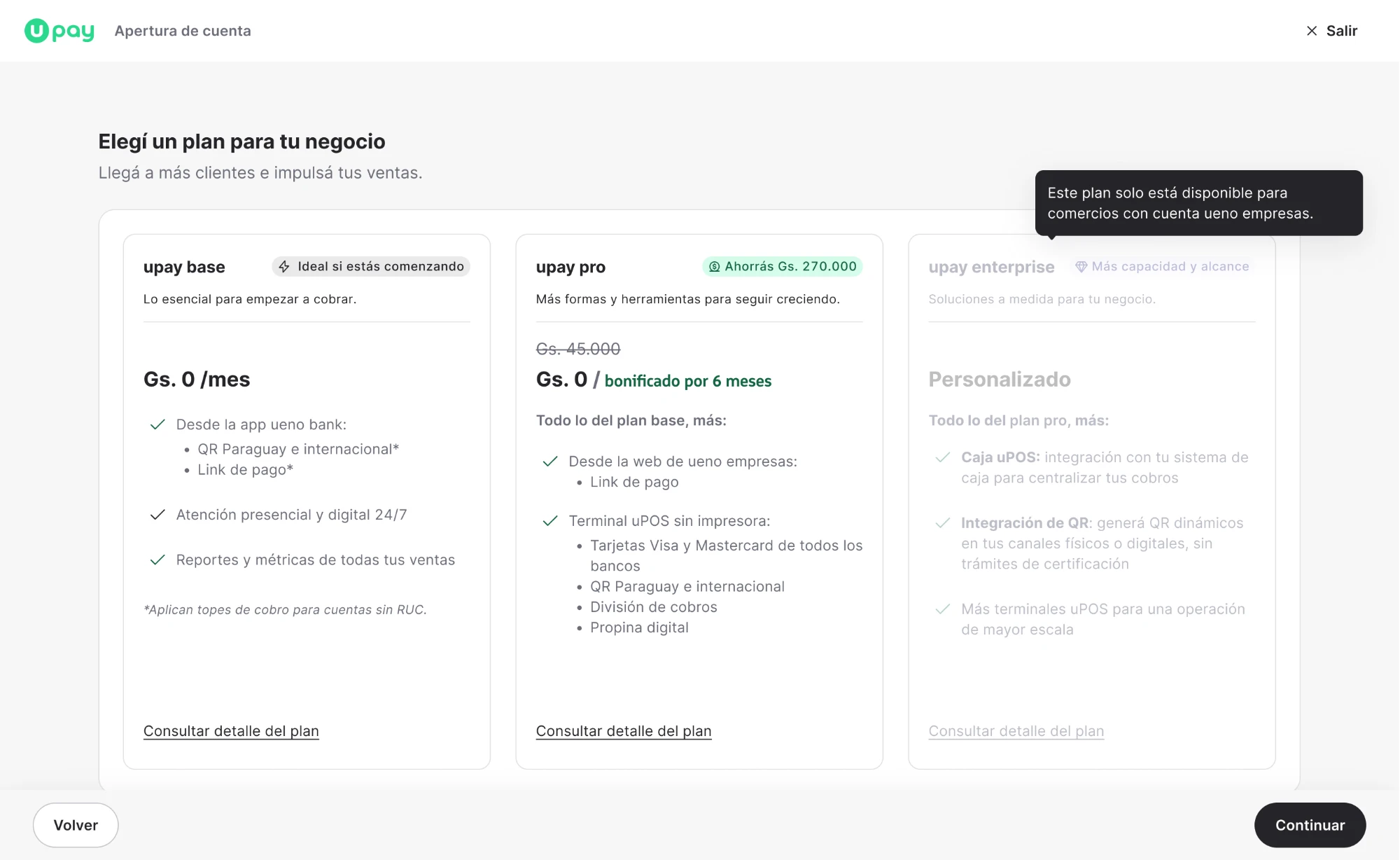
We also decided to keep Enterprise visible for individual accounts, even though they couldn’t sign up for it from there. Instead of hiding it, we explained that it required a Business account.

That way, people could see the full offer without being confused about which options were available to them.

Visible, with the reason why

Instead of hiding it, we showed it disabled and with the explanation: “This plan is only available for merchants with a ueno empresas account”.

02Stop asking questions that made no sense

The question “Do you already have a POS?” was no longer needed.

Before: a single form

“Do you already have a POS?”

No → order oneYes → what if they wanted another one?

After: a path for each need

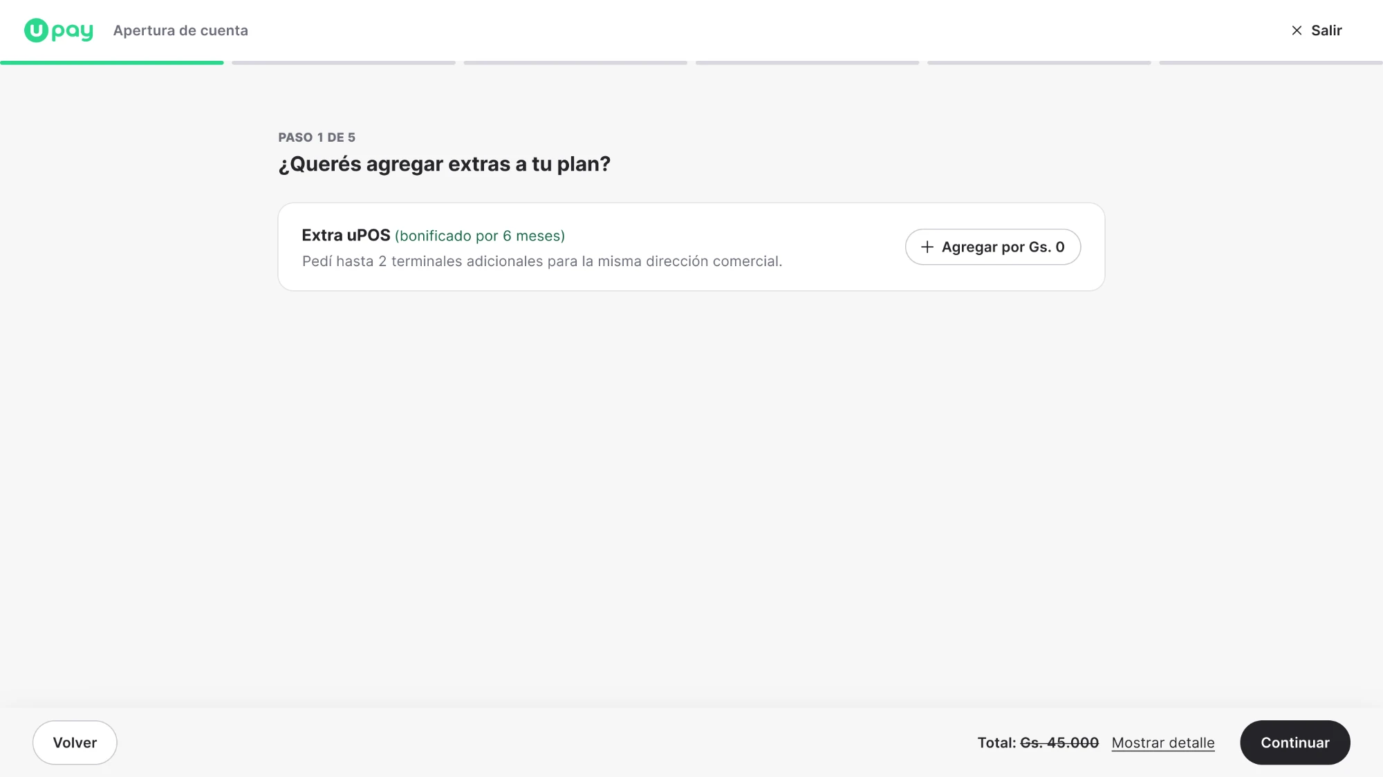
Signing up for the first timeGoes through the onboarding. With Pro, one terminal is included and they can request up to two more.
Already a customerManages new terminals from their account, without signing up again.

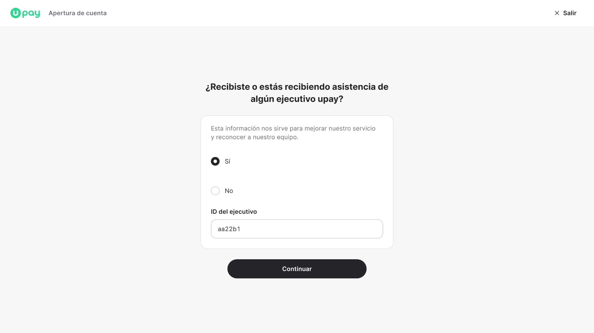
We also split the form into steps with clearer goals and reorganized questions, like the one about sales assistance, so they appeared when they actually made sense.

03Don’t confuse a sign-up with a request

Enterprise needed a different treatment.

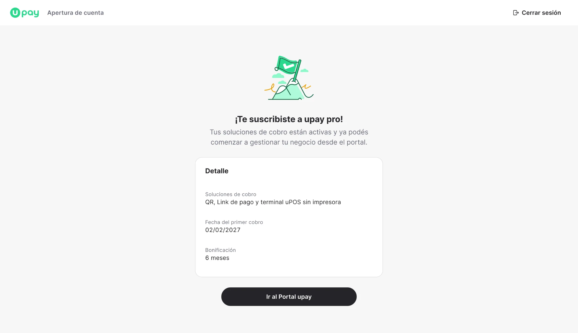
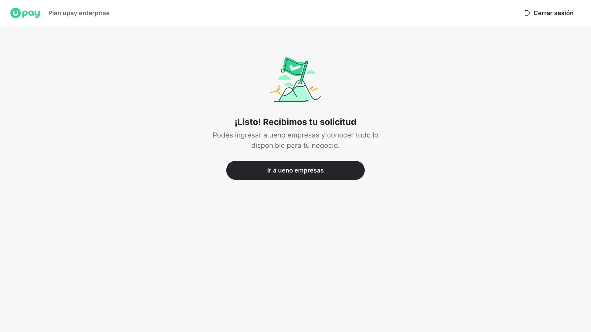
Base and Pro let people sign up right away; Enterprise worked as a custom request that a sales executive then followed up on.

That changed both the flow and the messages.

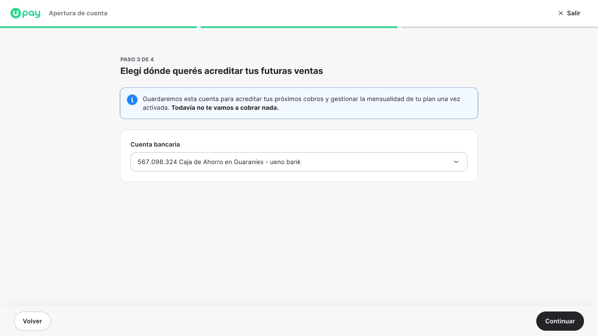
For example, instead of asking where they wanted their sales deposited, we used “Choose where you want your future sales deposited.”

That “future” helped make it clear the service wasn’t active yet.

Base and ProChoose where you want your sales deposited

EnterpriseChoose where you want your future sales deposited

We also explained that sending the request didn’t mean signing up automatically or being charged.

A small difference in wording, but an important one to avoid setting the wrong expectations.

04Think about the whole experience, not just the sign-up

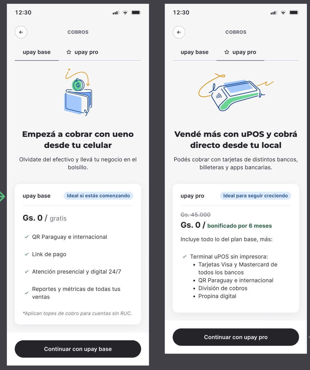
The onboarding used to live only on upay’s website. Now it could also start from the ueno app and ueno empresas.

We had to adapt the flows to the account type and the options available in each channel.

upay base and upay pro plans inside Cobros (in Spanish), in the ueno app
In the ueno app.

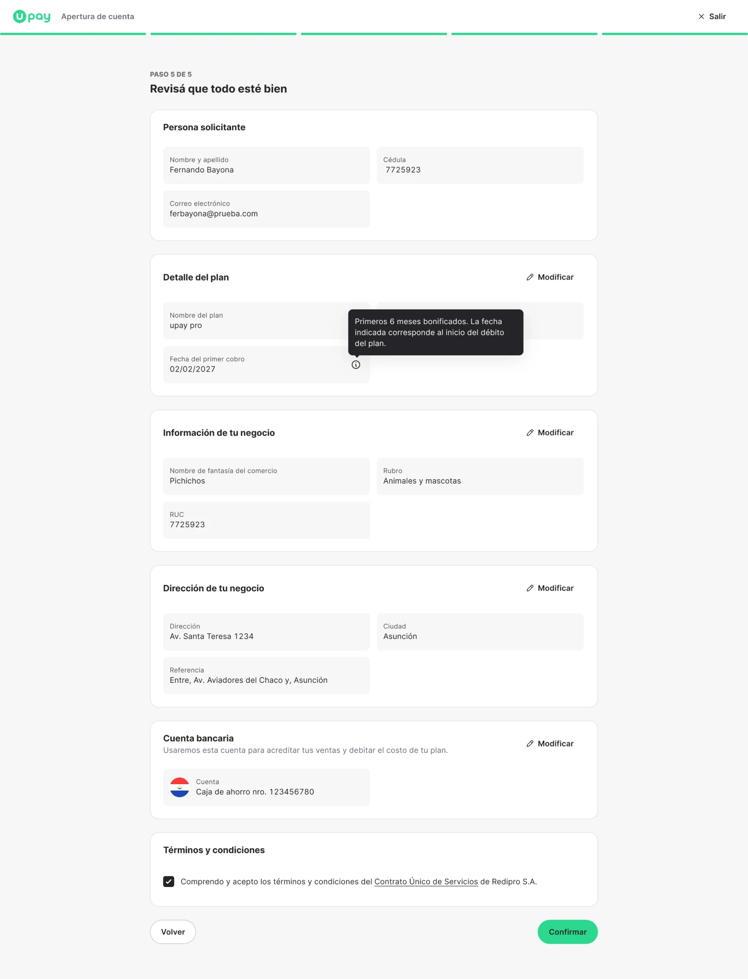
We also redesigned the sign-up summary so people could review and correct their details without starting over.

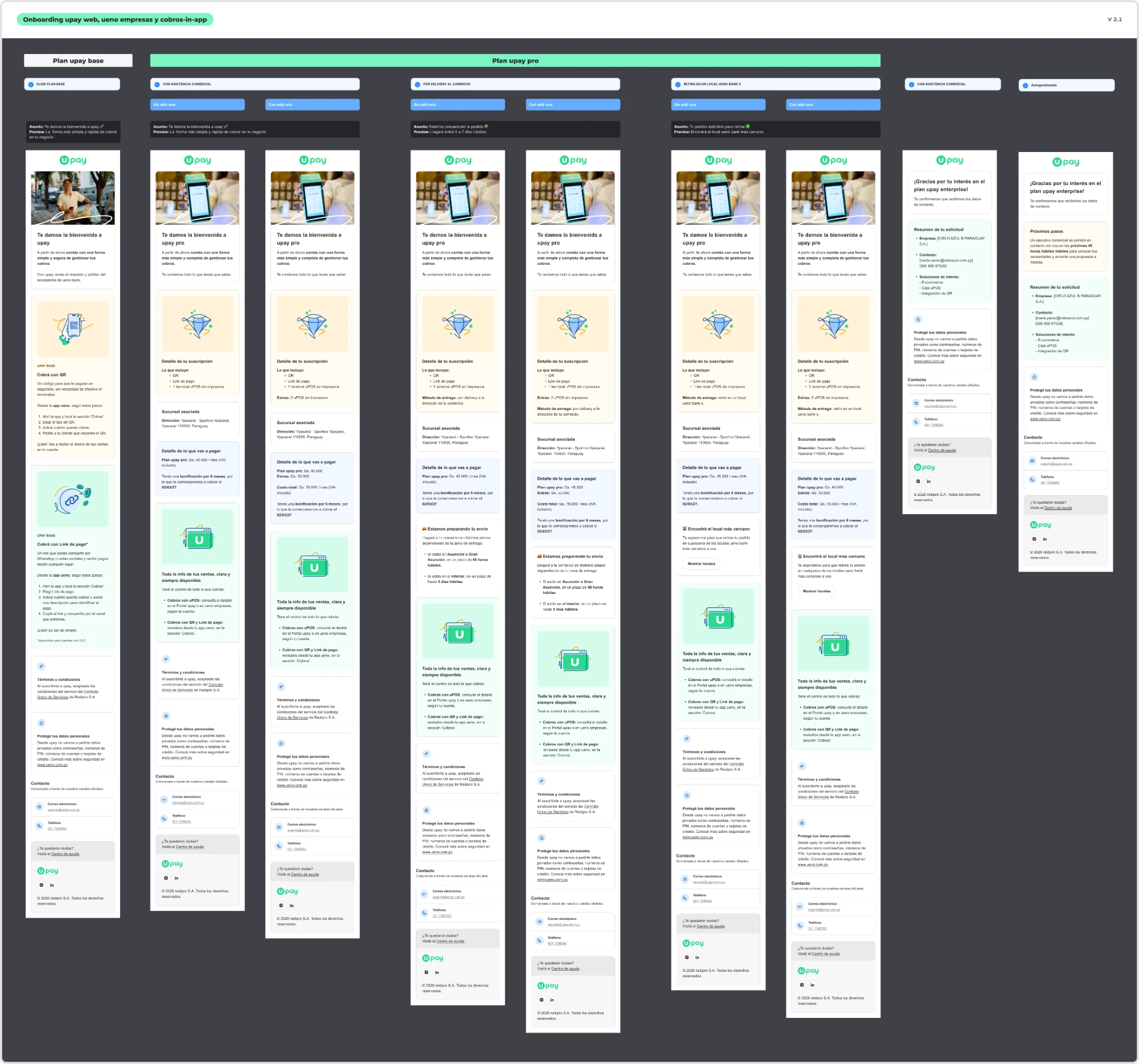
And I worked on transactional emails specific to each plan, covering everything from terminal delivery to the Enterprise sales contact.

  • BaseHow to start getting paid
  • ProTerminal delivery
  • EnterpriseThe sales contact
Transactional emails (in Spanish) that differ by plan, delivery method and sales support

Because finishing a form doesn’t mean the experience is over.

Results and impact

During its last two months of operation, it recorded more than 1,700 sign-ups.

3

plans, each with its own flow

3

entry points: web, app and empresas

+1,700

sign-ups in its last two months of operation

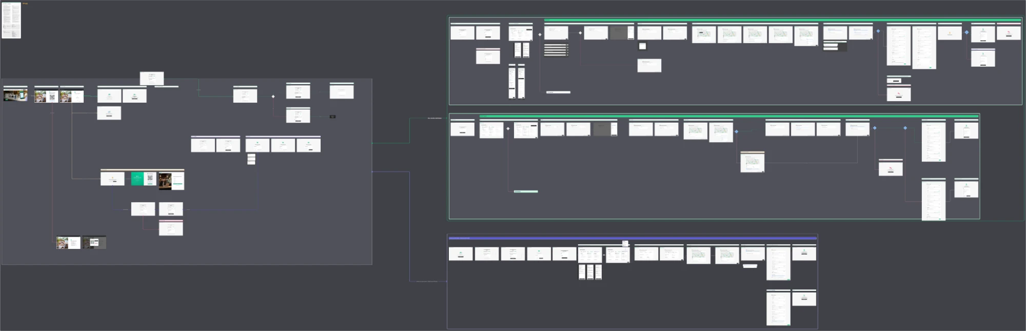
Full flow in Figma with the journeys for upay’s website, the ueno app and ueno empresasView larger ↗
The journeys across the three channels. Part of the Figma deliverable.

Tracking was cut short by ueno bank’s situation, so we couldn’t measure conversion, self-service sign-ups or behavior by plan in depth.

The 1,700 sign-ups are an observed result, not an improvement we can attribute exclusively to the redesign.

One improvement was also left pending: making it easier to compare features across plans without going in and out of the information panels. We had identified it for a next iteration, but it never got built.

Pending improvement

What I take away

I think the most interesting part of this project was working, for the first time, on an onboarding flow that didn’t live in just one place.

Until then, my experience with sign-ups had been focused on one specific product or channel. This was different.

If we changed something in the web onboarding, we needed to understand what happened in the ueno app and in ueno empresas.

And it wasn’t always about replicating exactly the same thing, so it made me think much more about the whole ecosystem.

It was also a project where I took part in decisions that went beyond content, and I learned a lot about the importance of coordinating decisions across teams with different priorities.

The project started because we had to add a few subscription plans.

The request

Add a few plans

What it became

  • Review questions
  • Separate flows
  • Design different ways to sign up
  • Organize communications
  • Take the onboarding to more places

So yes, there was quite a bit more to do than adding a few plan cards.