← Back

Case 3 · Banco Supervielle

I got tired of rewriting the same copy, so I built a system.

How a few content decisions that kept coming up turned into 32 components, four releases and a lot more Figma knowledge than I ever thought I’d need.

Responsibilities
Leading the initiative, content strategy, research, pattern design and component documentation.
Tools
Figma, Confluence, interviews and usability testing.
Results
32 components, 4 releases published and a score of 76.2 in the usability evaluation (SUS).

Project summary

At Banco Supervielle we had a visual Design System and a voice and tone guide, but many content decisions were still being made from scratch.

I led the creation of a Content Design System to build criteria, examples and reusable copy into the components Product Designers used.

The goal was to reduce inconsistencies and help teams make content decisions with more autonomy.
The challenge

One team needed a connection error message and solved it one way. Another needed something similar and wrote it differently.

And the same thing happened with feedback screens, buttons, notifications and other components.

One team

Connection error

Another team

Connection error

And yet another

Connection error

The same situation, written in different ways.

It wasn’t that we lacked criteria. The problem was that those criteria weren’t built into the tools we used to design.

Already existed

Visual Design SystemThe tools to design.

Already existed

Voice and tone guideThe criteria to write.

On top of that, the Content team had shrunk and Product Designers needed more autonomy.

Did it make sense to keep answering the same questions over and over?

My role on the team

I worked as a UX Content Designer and led this initiative, in collaboration with the Content team and Design Ops.

My work included:

  • 01

    Research with Product Designers to understand their needs and evaluate the proposals.

  • 02

    Defining patterns, guidelines and reusable copy for the components.

  • 03

    Planning four releases to roll out the system progressively.

  • 04

    Documentation and content critique sessions to review the decisions.

  • 05

    Coordinating with Design Ops to integrate the solutions into the official Figma library.

The context

Before building the system, I took inventory of the existing components and studied how they were organized.

  1. Atoms
  2. Molecules
  3. Organisms
  4. Templates
How the existing components were organized.

I also researched how Product Designers preferred to work. In an initial evaluation with six participants, we found two interesting things.

6 out of 6

preferred to check the guidelines directly from Figma

6 out of 6

valued having preset examples

That gave us a clear direction. The criteria had to be within reach while people designed, not hidden in another document.

The decisions

01Don’t turn everything into a template

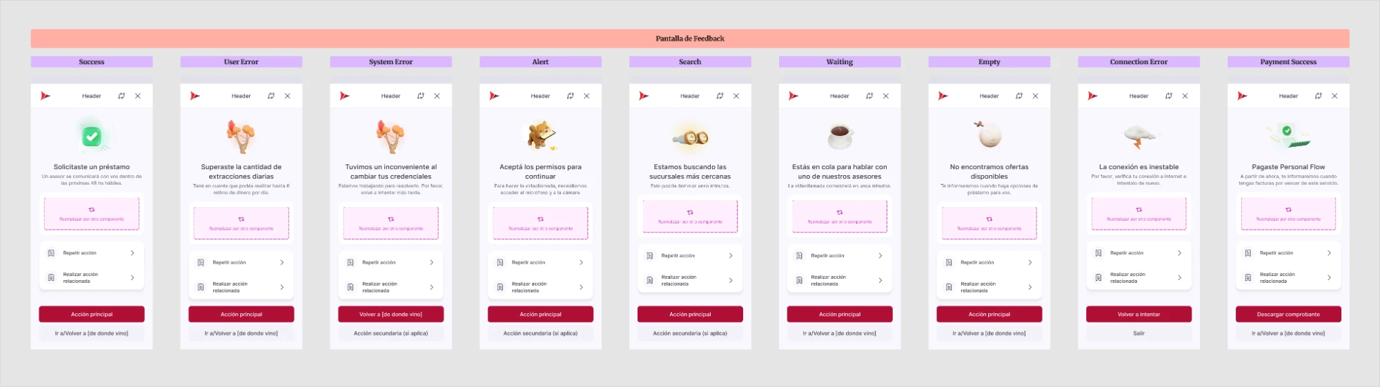
Feedback screens were a good example of reusable content.

I designed copy for recurring situations, such as connection errors, system problems and successful operations. When you selected a variant in Figma, the title and description changed automatically.

The variants of the feedback screen (in Spanish): success, user error, system error, alert, search, waiting, empty, connection error and successful payment, each with its title and description
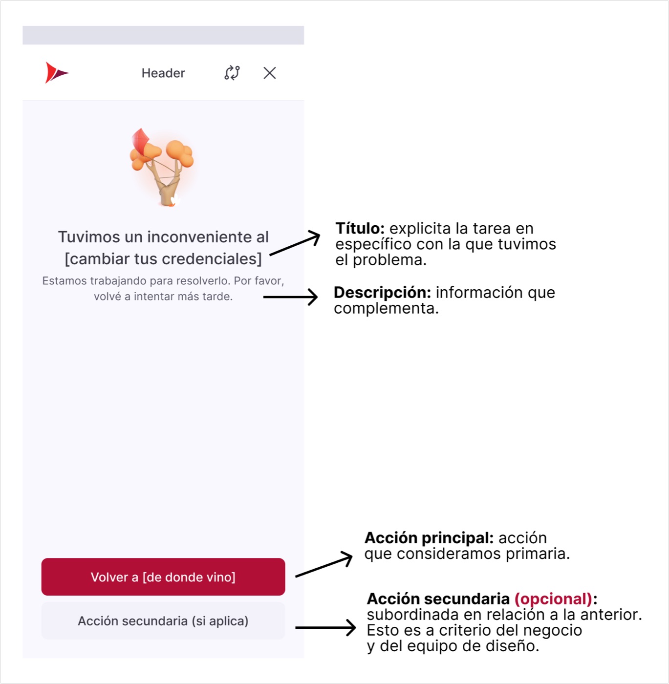
Anatomy of the feedback screen (in Spanish): title, description, primary action and optional secondary action
The anatomy of the feedback screen.

What was left open on purpose

The buttons

  • Sometimes the right thing is to try again.
  • Other times, to take a different action.
  • And sometimes no button is needed.

Documented criteria, with the decision in the designer’s hands.

But not every component worked that way.

A tooltip, for example, depends too much on context to have a universal message.

In those cases I chose to document patterns, examples and usage criteria.

A usage criterion, as an example

Is this information needed to complete the task?

Yes → it has to be visible on the screen.No → it can go in a tooltip.

The idea wasn’t to tell designers exactly what to write, but to give them tools to decide.

02Bring content to where design happens

The research had shown that Product Designers preferred to check the criteria from Figma.

So I worked on integrating preset copy and linking guidelines to the library components.

I also added a Content Design System section to the voice and tone guide, for anyone who needed more detailed information.

What it offers

  • Preset copy
  • Guidelines linked to the components
ContentDesign System

Where it’s consulted

  • FigmaExamples while designing
  • Voice and tone guideMore detailed information

03Build a system that could grow

It made no sense to try to solve every component at once.

I organized the project into four releases, starting with frequently used components and moving forward until all 32 in scope were covered.

Release 115%
Release 240%
Release 370%
Release 4100%

First, the frequently used ones: feedback screens, dialogs, banners, buttons and notifications. Then, forms, navigation, selection and other interface elements.

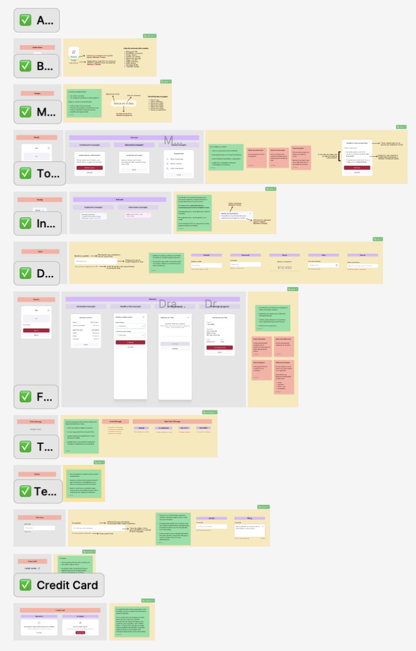
Part of the component inventory in Figma (in Spanish), each one marked as complete
Part of the inventory, component by component.

Each delivery included the component analysis, the definition of criteria, the examples and the documentation.

The proposals went through reviews with the Content team, and then we coordinated their implementation with DesignOps.

Having everything designed in my files was one thing; getting it to actually be part of the system teams used was another.

Results and impact

We managed to publish all 32 components in four releases, building preset content, patterns and guidelines into the bank’s Design System.

32

components published

4

releases to roll it out progressively

2

research studies: before and after

But I wanted to know if we were really helping Product Designers, so I designed a second study with nine participants from three product verticals.

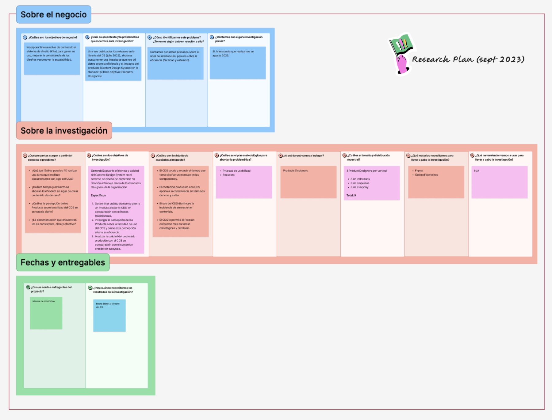
Research plan from September 2023 (in Spanish): business goals, questions, hypotheses, methodology and a sample of nine Product Designers, three per vertical
The research plan for the second study.

The results were:

76.2/100

in usability (SUS), within a range considered acceptable.

4.07/5

in perceived usefulness of the preset content.

4.10/5

in satisfaction with the documentation.

In three specific tasks, completion time dropped by between 70% and 87% when using the system. It wasn’t a result we could generalize to every task, but it was a positive sign.

Task 1

6 min 24 s
51 s

−87%

Task 2

5 min 55 s
1 min 46 s

−70%

Task 3

3 min 16 s
58 s

−70%

Some designers said:

“It helps me deal with the blank page.”

“I feel it gives me more confidence when I have to write.”

What the Product Designers said.

We also found opportunities for improvement.

Integrate the documentation better into FigmaIt was still one step away from where design happens.
More time for newcomersNew team members needed time to get familiar with it.

What I take away

This project taught me to think about content at a different scale.

It was no longer just about working out what message a screen needed, but about identifying which decisions could be reused and how to help other teams apply them.

It was also an important leadership experience, and it brought me much closer to Product Design, especially to working with components and systems.

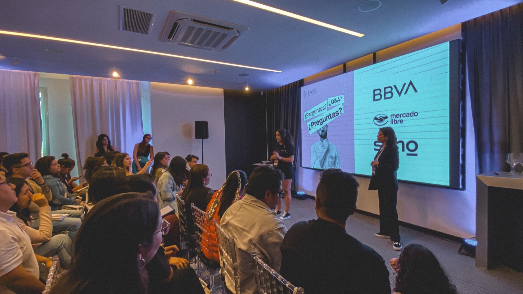
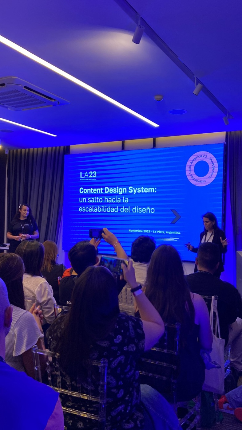
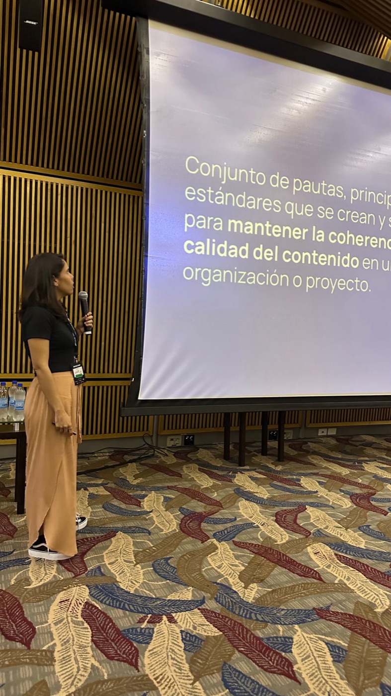
In 2023, a colleague from another financial institution and I shared our experience with Content Design Systems at Interaction Latin America.

The talk on Content Design Systems at Interaction Latin America 2023, in front of the audienceScreen with the title of the talk: “Content Design System: un salto hacia la escalabilidad del diseño” (a leap toward design scalability), November 2023, La PlataLuz presenting in front of a slide about content consistency and quality
Interaction Latin America 2023.

It was an important moment because it made me realize how much I had learned, and that this knowledge could be useful to other teams too.